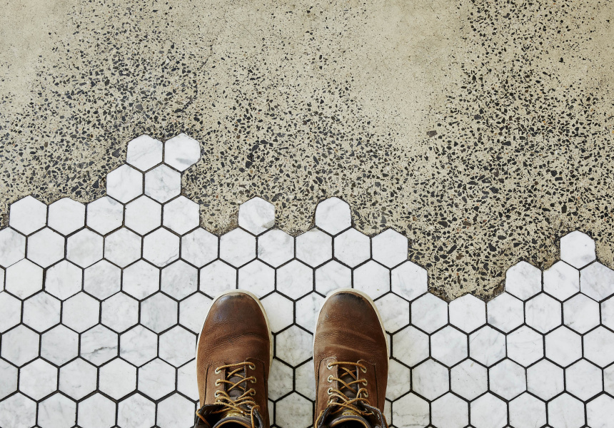
Nathan Toleman had a problem. Last year the owner of Richmond’s Top Paddock was looking for a way to unify the ground floors of a Victorian terrace and a shiny new apartment block made of glass and steel for his next South Melbourne cafe. Collaborating with Studio You Me, Toleman decided to create a tiled mosaic feature on the floor, “That bled into the concrete and felt like a wave of water flowing out,” Toleman says. His concreters and tilers were wary. A number of times Toleman said, “Let’s forget about this – it’s too hard.”
They persevered with the inlay but it was a stressful, time-consuming and expensive exercise. Moreover, they could have simply poured concrete and polished it, which would have cost approximately $10,000 less, Toleman says.
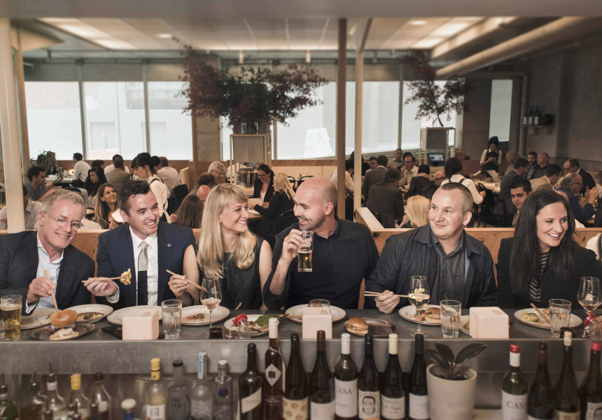
In the end, Toleman and his business partners spent more than half-a-million dollars building The Kettle Black, a sleek cafe that merges elements of a cafe and a restaurant, in the sophistication of both the menu and the design.
We think you might like Access. For $12 a month, join our membership program to stay in the know.
SIGN UPIt marked the first time Toleman had used a design firm to tailor the interior of one of his eateries. The Kettle Black fit-out (and Toleman’s focus on it) is symptomatic of the aesthetic overhaul our city’s dining spaces have undergone over the past few years.
“Once, it was much easier to serve a great product in a shitty place,” says Justin Northrop, a co-director and founder of Techne Architecture + Interior Design. “The experience is viewed as part of a whole now – the balance has changed between product and total experience.”
This design creep is ubiquitous in every class of eatery, in every suburb of Melbourne. The gelato purveyor and the coffee roaster is as focused on the aesthetics and atmosphere of an interior as the fine-dining restaurateur.
Restaurant-focused media is image- heavy, and for some time operators have been preoccupied, “With how their spaces look and feel, as well as what they serve,” Northrop says.
Reality television, visual social media such as Instagram and Facebook, as well as the increasing influence of image-led publications such as Broadsheet, are driving a democratisation of and increase in design awareness. It all contributes to a movement Northrop calls, “The rise and rise of carefully considered cafes.”
“Even the pop-ups have become sophisticated,” says Adele Winteridge, the director of Foolscap Studio, a young design firm housed in a third-floor loft studio in the CBD. “You go to one, it’s amazing, and you can’t go back from that – the bar gets raised.” This is of course exacerbated by a constant discussion – on and offline – about the food we eat and the places we go to eat it. “That’s the turning point,” Winteridge says. “There have always been well-designed spaces, but now they’re celebrated more.”
Not everyone is convinced this a positive development. While the fixation on design has led to spaces that are genuinely innovative, it has also led to spaces that feel like replicas, or as Dion Hall, co-director of design studio Projects of Imagination (POI) calls it, “Regurgitation.”
“There are a number of cafe operators and restaurateurs – cafes seem to have fallen into quite a vicious trap – not really standing for much more than some material they’ve visited elsewhere,” Hall says. A focus on image and perception, rather than original ideas, is driving, “a sea of sameness” throughout the Melbourne hospitality sector.
For this story, we spoke to four Melbourne-based design firms – Techne, Foolscap, Hecker Guthrie and POI (Projects of Imagination) – along with a flourishing restaurateur (Kate Bartholomew of Tonka and Coda) and the owner of an ever- increasing cafe empire (Nathan Toleman) about the state of dining design in Melbourne right now.
There is some agreement on how we got here – though thoughts on whether we’re at a low point or a high point differ. There are also opinions on where we are going. There’s no doubt, however, that we have reached a watershed moment.
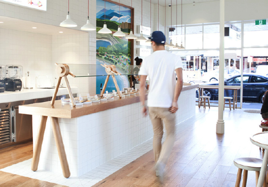
McDonalds has refurbished a standalone McCafe in Sydney, renaming it The Corner. Except for a subtle logo, it bares none of the hallmarks of the iconic fast-food chain, but it looks a lot like another franchise with which you’re probably familiar: the stylish local cafe. There’s blonde timber; stools made of wood and steel; communal high-top tables; white subway tiles; and small tin pots with succulents – all badges of the slick, industrial- meets-Scandinavian aesthetic that has come to dominate our food scene in recent years.
“It really does highlight the fact we’ve arrived at a very saturated period of a certain aesthetic,” Dion Hall says. “It’s a very pointed moment and I don’t necessarily think it’s a bad thing. It’s a forceful hand to say, come on guys – it’s time to move on.”
Sitting at Tonka on a Thursday afternoon in late January, co-owner Kate Bartholomew recalls the process of designing the restaurant a few years earlier. At the time, she lay in bed at night ruminating on the ambience and feeling she wanted to create in the new space. In discussions with Techne, which she enlisted as the interior designer, she used words such as “fresh” and “magical.”
She wanted the space to be totally unique. Tonka is a sophisticated and refined space, with a whimsical, custom-made mesh ceiling sculpture that flows through the entire restaurant. Bartholomew, who also co-owns Coda, says there is more pressure to be, “Innovative and different – to stand out. You have to spend money on fit-out if you want to be in that top echelon.”
Moreover, those standards must be maintained in light of the unforgiving Melbourne consumer, who is today more educated about every facet of the dining experience, from food and wine to fit-out. The Coda owners, for example, have been tweaking the restaurant’s interior in recent months to ensure it remains current and fresh.
Similarly, local pubs such as The Prahran Hotel and Bridge Hotel have been subject to multi-million dollar upgrades; makeovers the owners hope will enable them to compete with the explosion of casual dining spaces.
“There’s always a place for traditional pubs, but there’s a whole tier of venues that become irrelevant because the way we socialise is changing,” Techne’s Justin Northrop says. The refurbished, modern pub is better equipped to compete with the premium- casual offerings that have become so popular with Melburnians.
Design firms and restaurateurs say reality shows such as The Block and MasterChef have played their part in all this, elevating consumer expectations of what is possible in both space and food.
Nathan Toleman is sitting on a bench on a large grass median across the road from his eatery, Top Paddock in Richmond, going through the costs of a cafe fit-out. “Kitchens are $150,000 – for a good kitchen. Electrics are $20–$30,000; plumbing is $20– $30,000 concrete is $20–$30,000; good quality chairs are $300–$400 each. It all adds up,” he explains. Not all cafes – or even restaurants – can or would spend that much on a single chair, but when someone like Toleman does it, it ups the ante for competitors.
Toleman says people want restaurant- quality food, service and experiences in a cafe, which means operators have to spend restaurant prices on both fit-out and back-of- house operations. As an example, his kitchens feature gourmet culinary appliances such as a sous vide machine and Pacojets.
“We’re all looking at how we shape an environment and an experience beyond just: ‘we’re going to serve you a coffee’,” says Adele Winteridge. “In Melbourne you can’t get away with that; it’s too competitive.” Dion Hall says this intense competition is the most influential factor in driving the design fixation.
“The restaurateur and cafe operator are under a great deal of scrutiny. How does one gain the winning edge?” With a more conscious and demanding consumer, every visual aspect of the dining experience must be addressed, “From the uniform right through to the door handle,” he says.
It’s a development that’s made clear when Techne’s Nick Travers talks about the growing number of collaborators involved in the fit-out of one of their projects: the interior designers; the owner; the graphics team; the ceramicist; the lighting people.
Was the list always so long? I ask before he can finish. “Definitely not,” Justin Northrop says, then adds: “It’s so much harder for an aspiring cafe owner to get into the business without financial backing or industry connections.
The buzz some places need to justify their expense is prohibitive for places with no backstory.” In other words: when the stakes are this high, it’s hard to be the new guy. And it’s hard to compete if you’re a cafe owner who doesn’t already have a reputation.
Design drives hype, and hype is a desired precursor to the opening of any new dining establishment. “It used to be that you would open your doors, cut your teeth, offer really good service, offer really good food, before you got reviews,” says Hamish Guthrie. “Now you get reviewed before you’ve even finished a project.”
Toleman’s Top Paddock has nearly 26,000 Instagram followers, a number that increases daily. “The minute we start building a new space we can start exposing people to that,” he says. In the world of hospitality design, the internet is a great tool for research and marketing, but it may also have become a manual for replication.
When Tracey Sisson approached POI last year to design Yardmill, an artisanal, locally focused food store in Toorak, she did it armed with a heap of images. “She walked in with a folder of tear sheets and I simply said – I don’t want to see them,” says Dion Hall. “We said to Tracey: let’s move away from a certain aesthetic. Let’s recognise there’s a certain vernacular that’s been formed and we don’t believe it’s a good one. And she was in agreement.”
Sisson and POI strove to create a deli that was quintessentially Australian. The result is a modern and elegant food store – one that dispensed with the traits typically associated with a European-style delicatessen as well as those associated with a contemporary Melbourne food joint.
But there are reasons why they have been so widely embraced in Melbourne and elsewhere. As Paul Hecker explains, it’s a look that works well day and night; it’s casual and warm; it suggests history and appeals to a sense of nostalgia.
It even makes the customer look good, as the warm yellow glow of an Edison bulb is more flattering than an LED. And practically, the materials are inexpensive and easy to access. “Certain pieces have been overused, like the Tolix chair, absolutely,” says Hecker. “But there’s a reason for it. It’s inexpensive, it’s hardwearing, it’s comfortable.”
In Adele Winteridge’s Hardware Lane office we discuss why blonde timber has become so omnipresent. She gestures to the light wood table at which we’re sitting. “This is Victorian Ash,” she says. “It’s a lower-priced hardwood than a dark wood. It’s cheaper; it’s more sustainable; it grows quicker; it’s Victorian; it’s really accessible for builders.” Darker hardwoods, though beautiful, may take months to reach a site, she explains.
When Winteridge does use a widespread material, like a white tile, she tries to use it in a new or different context, subverting its stereotype through design. “I look back on some of our designs and I think we’re partially to blame for some of it, too,” says Dion Hall, of Melbourne’s oft- repeated motifs.
Neon signs that have become commonplace in eateries throughout the city were no doubt popularised by the fluorescent lights that adorn Chin Chin, Baby Pizza, yoghurt chain Yo-Chi and now Supernormal, all of which were designed by POI.
“But we were never using materials to express a certain culture or a certain trend. We were focused on telling a story and we felt that story was relevant to that context.” He continues, “However, operators and studios should not assume by replicating other venues’ design attributes this means they have a successful formula.”
They say imitation is the sincerest form of flattery, so doesn’t replication validate their creations?
Design-wise, it validates it, Hall says, but, “on the business side, more so for the client, it devalues it.” He uses Yo-Chi as an example. The frozen yoghurt company has raised serious concerns with POI about competing businesses copying Yo-Chi’s concept, interiors and elements of its brand.
“I do not think that any consumer would say that it’s merely a coincidence that the stores appear so similar,” Hall says of some of the yoghurt outlets that opened after Yo-Chi’s 2012 launch. “In my opinion, this copying amounts to plagiarism. “Yo-Chi has invested significant resources and time into developing its brand and intellectual property and will defend vigorously any attempt by others to infringe on its rights,” Hall adds.
One reason the industrial-hipster aesthetic may have reached such pervasive levels is that it has become an easily replicable fit-out. “Anyone can go to the tile shop and get the white tile; they can go and get the same lights,” says Adele Winteridge.
“They can get the same components and kit of parts and recreate this look.” The idea being that if they apply a certain aesthetic – an aesthetic previously used in a ton of successful establishments – it prescribes a certain outcome: customers. “But by having all those things I don’t think it’s a sure win at all,” Winteridge says. “I actually think now – especially because McDonalds is doing it – it’s a ticket to failure.”
While Dion Hall is sceptical of any near- term changes to Melbourne’s design landscape, for others, there are near-term evolutions.
Nathan Toleman predicts the continued diversification of the cafe, the pub and the restaurant. He sees refurbished pubs introducing breakfast offerings. He sees more cafes – led by his – incorporating what has long been a feature of the upscale restaurant: the
open kitchen.
“People want to be more involved in the process, so we’re looking at doing more open kitchens. The Kettle Black is the first time we’ve created a window where the kitchen is a part of the space and I think we’re going even further,” he says.
Adele Winteridge believes Melbourne will see an increase in mixed-use spaces, where retail and hospitality merge, or where the buying and eating of food occurs in the same zone. “That will drive space and how we use it, not necessarily a design aesthetic,” she says.
Winteridge, Techne and Kate Bartholomew all mentioned the focus on health, wellness and locally sourced and indigenous produce continuing, which will inform spaces aesthetically and functionally. In physical terms, this means increased use of locally made, handcrafted products and raw materials.
Hecker Guthrie wants to move away from, “Lining every surface in a materiality,” Paul Hecker says. “I would like to think we are becoming more sophisticated – that we don’t have to rely on ‘a theme’ – and we focus more on creating individual spaces filled with exquisite objects.”
This idea of a more stripped-down, anti- design design is not limited to Hecker’s crystal ball. “We’re starting to look at Brutalist architecture – the pared-back, Louis Kahn-type reference material,” Techne’s Nick Travers says.
“We’ve only touched on minimal and really pared-back fit-outs,” Techne’s Justin Northrop adds. “There will be a few seriously minimal, sharp fit-outs coming. And sitting next to that will be some crazy, post-modern reinvention of Memphis Group design. More geometrics. More colour. More loud abstract interiors.”
Design standards in Melbourne have risen to unprecedented levels and it’s a bar that will keep being raised. There’s no denying that this evolution results in some homogeny, but it also drives designers to rethink their process, innovate and create ever-more imaginative and inspired interiors.
Nathan Toleman says that every time he builds a new cafe, he, “Feels the pressure and the need – even from ourselves – to create something better.” Something singular and special, which is difficult to replicate. And amidst this competitive ascent towards what is better, smarter and more beautiful, as a city, we are the definite winners.


