Depending on which source you consult, Google’s Android operating system powers between 45 and 60 per cent of Australian mobiles. By default, these roughly eight million phones do not send location information to Google, the company says.
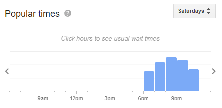
When users do choose to enable tracking, Google aggregates their anonymised location data and, among other things, uses it to forecast traffic jams for Google Maps and update those handy real-time graphs you see in search results, showing how busy a particular restaurant is.

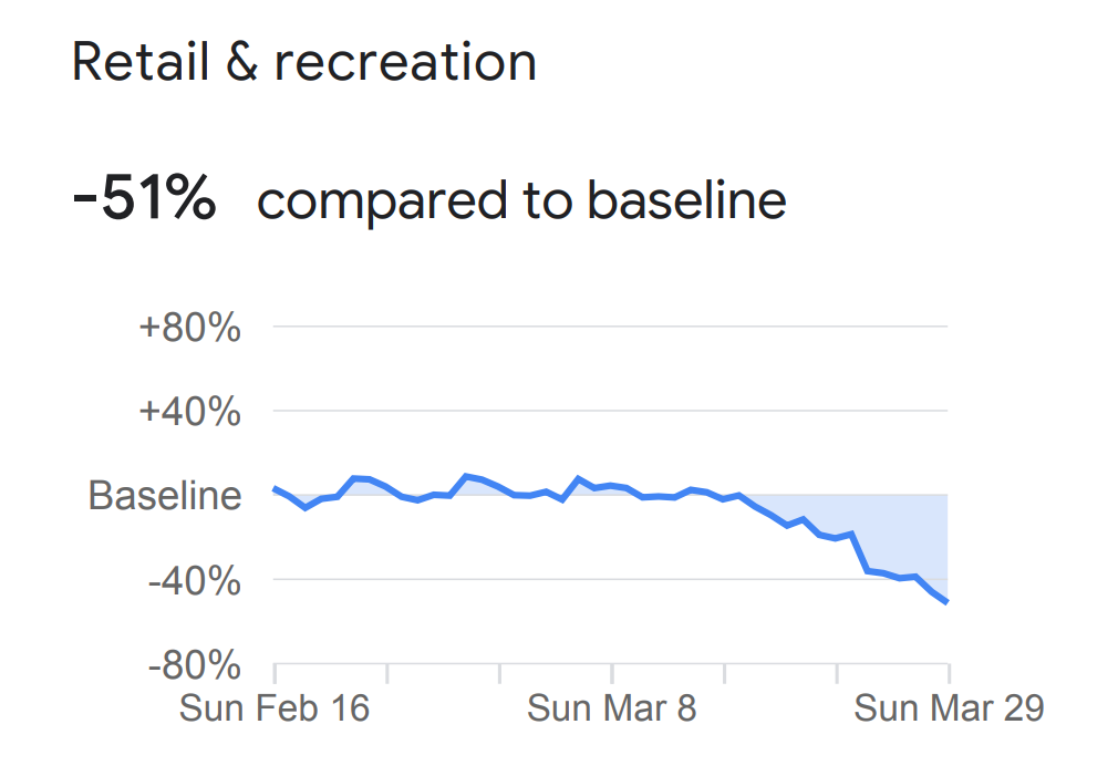
Now the California-based company is using that same data to generate publicly available “Covid-19 Community Mobility Reports” for most countries in the world. China and North Korea are notably absent from the list and may or may not be added later.
The reports (Australia’s is available here) are broken down into separate states and illustrate the day-to-day changes between February 16 and March 29 in visitation to six location categories: homes; workplaces; parks and beaches; groceries and pharmacies; and retail and recreation spots such as restaurants, cafes, shopping centres, theme parks, museums, libraries and movie theatres.

“We’ve heard from public health officials that the same type of aggregated, anonymized insights we use in products such as Google Maps could be helpful as they make critical decisions to combat COVID-19,” says the statement on the reports’ landing page.
The Australian data also reveals which parts of the country are doing well at quarantine, and which aren’t doing so well. The ACT, for example, which came last in four out of the six included categories for Australia. Victoria and Tasmania, meanwhile, place first and second in nearly every category.
The full rankings are listed below, but should be taken lightly, due to the underlying differences in lifestyle and employment between the states and territories. (“We don’t recommend using this data to compare changes between countries, or between regions with different characteristics (e.g. rural versus urban areas),” Google says.)
It’s also unlikely the data takes into account the large portion of the workforce with no fixed place of business, such as tradespeople. Finally, some states and territories are more afflicted by coronavirus than others, making stricter quarantine measures especially necessary.
Retail and recreation
1. VIC -51 per cent
2. TAS -50 per cent
3. NSW -44 per cent
4. SA -43 per cent
5. ACT, QLD & WA -40 per cent
6. NT -35 per cent
Grocery and pharmacy
1. TAS -30 per cent
2. VIC -26 per cent
3. QLD -19 per cent
4. WA -16 per cent
5. SA -15 per cent
6. NSW & NT -13 per cent
7. ACT -3 per cent
Parks and beaches
1. TAS -70 per cent
2. VIC -55 per cent
3. WA -37 per cent
4. QLD & SA -33 per cent
5. NSW -27 per cent
6. NT -20 per cent
7. ACT +38 per cent
Train, tram, bus and ferry stations
1. VIC -68 per cent
2. TAS -62 per cent
3. NSW & QLD -57 per cent
4. NT, SA & WA -55 per cent
5. ACT -52 per cent
Workplaces
1. VIC -37 per cent
2. NSW -35 per cent
3. ACT -31 per cent
4. QLD -30 per cent
5. SA & TAS -28 per cent
6. WA -26 per cent
7. NT -23 per cent
Residential
1. VIC +16 per cent
2. NSW +14 per cent
3. TAS & WA +13 per cent
4. NT, QLD, SA & TAS +12 per cent
5. ACT +11 per cent


